Leukemia Remission Times
These data are the times of remission (in weeks) of leukemia patients. Out of the 42 total patients, 21 were in a control group, and the other 21 were in a treatment group. Patients were observed until their leukemia symptoms relapsed or until the study ended, whichever occurred first. Each patient in the control group experienced relapse before the study ended, while 12 patients in the treatment group did not come out of remission during the study. Thus, there is heavy right-censoring in the treatment group and no right-censoring in the control group.
One of the questions to ask about this dataset is whether the treatment
prolonged the time until relapse. Formally, we are interested in whether
there is a statistical difference between the time-to-relapse
distributions of the control and treatment groups. In this notebook we
will use the survive package to investigate this question.
In [1]:
import matplotlib.pyplot as plt
import seaborn as sns
sns.set(style="darkgrid", palette="colorblind", color_codes=True)

from survive import datasets
from survive import SurvivalData
from survive import KaplanMeier, Breslow, NelsonAalen
Loading the dataset
The leukemia() function in the survive.datasets module loads a
pandas DataFrame containing the leukemia data. The columns of this
DataFrame are
time- The patients’ observed leukemia remission times (in weeks).status- Event/censoring indicator: 1 indicates that the patient’s leukemia relapsed, and 0 indicates that the study ended before relapse.group- Indicates whether a patient is from the control or treatment group.
In [2]:
leukemia = datasets.leukemia()
display(leukemia.head())
| time | status | group | |
|---|---|---|---|
| patient | |||
| 0 | 1 | 1 | control |
| 1 | 1 | 1 | control |
| 2 | 2 | 1 | control |
| 3 | 2 | 1 | control |
| 4 | 3 | 1 | control |
Exploratory data analysis with SurvivalData
The SurvivalData class is a fundamental class for storing and
dealing with survival/lifetime data. It is aware of groups within the
data and allows quick access to various important quantities (like the
number of events or the number of individuals at risk at a certain
time).
If your survival data is stored in a pandas DataFrame (like the leukemia
data is), then a SurvivalData object can be created by specifying
the DataFrame and the names of the columns corresponding to the observed
times, censoring indicators, and group labels.
In [3]:
surv = SurvivalData(time="time", status="status", group="group", data=leukemia)
Alternatively, you may specify one-dimensional arrays of observed times,
censoring indicators, and group labels directly. This is so that your
can use SurvivalData even if your data aren’t stored in a DataFrame.
In [4]:
# Equivalent to the constructor call above
surv = SurvivalData(time=leukemia.time, status=leukemia.status,
                    group=leukemia.group)
Describing the data
Printing a SurvivalData object shows the observed survival times
within each group. Censored times are marked by a plus by default
(indicating that the true survival time for that individual might be
longer).
In [5]:
print(surv)
control

 1  1  2  2  3  4  4  5  5  8  8  8  8 11 11 12 12 15 17 22 23

treatment

 6   6   6   6+  7   9+ 10  10+ 11+ 13  16  17+ 19+ 20+ 22  23  25+ 32+ 32+
34+ 35+
The describe property of a SurvivalData object is a pandas
DataFrame containing simple descriptive statistics of the survival data.
In [6]:
display(surv.describe)
| total | events | censored | |
|---|---|---|---|
| group | |||
| control | 21 | 21 | 0 |
| treatment | 21 | 9 | 12 |
Visualizing the survival data
The plot_lifetimes() method of a SurvivalData object plots the
observed lifetimes of all the individuals in the data. Censored
individuals are marked at the end of their lifespan.
In [7]:
plt.figure(figsize=(10, 6))
surv.plot_lifetimes()
plt.show()
plt.close()
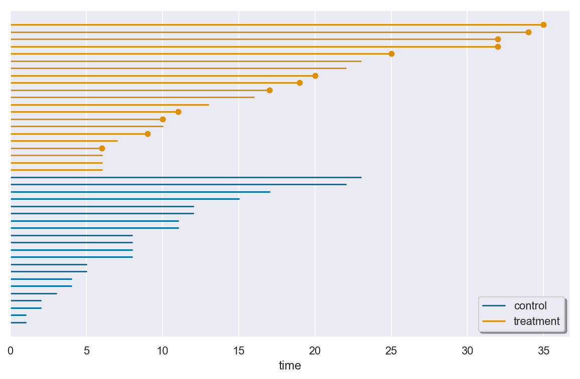
There are many longer remission times observed in the treatment group. However, while this observation is encouraging, it is is not enough evidence to guarantee a statistically significance treatment effect.
Computing the number of events and number of individuals at risk
You can compute the number of events that occured at a given time within
each group using the n_events() method, which returns a pandas
DataFrame.
In [8]:
display(surv.n_events([1, 2, 3, 4, 5, 6, 7, 8, 9, 10]))
| group | control | treatment |
|---|---|---|
| time | ||
| 1 | 2 | 0 |
| 2 | 2 | 0 |
| 3 | 1 | 0 |
| 4 | 2 | 0 |
| 5 | 2 | 0 |
| 6 | 0 | 3 |
| 7 | 0 | 1 |
| 8 | 4 | 0 |
| 9 | 0 | 0 |
| 10 | 0 | 1 |
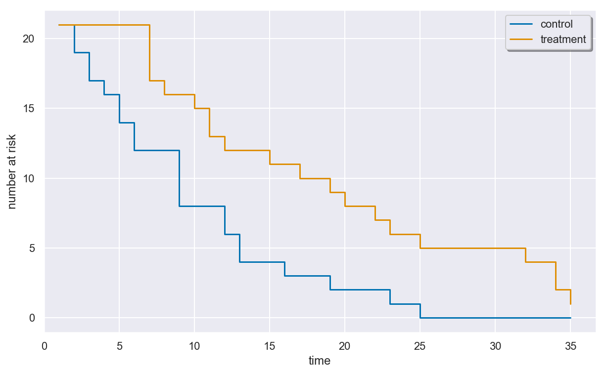
In a survival study, the number of individuals “at risk” at any given time is defined to be the number of individuals who have entered the study by that time and have not yet experienced an event or censoring immediately before that time. This number over time is called the at-risk process.
You can compute the number of individuals at risk within each group at a
given time using the n_at_risk() method. Like n_events(), this
method also returns a DataFrame.
In [9]:
display(surv.n_at_risk([0, 5, 10, 20, 25, 30, 35]))
| group | control | treatment |
|---|---|---|
| time | ||
| 0 | 0 | 0 |
| 5 | 14 | 21 |
| 10 | 8 | 15 |
| 20 | 2 | 8 |
| 25 | 0 | 5 |
| 30 | 0 | 4 |
| 35 | 0 | 1 |
Plotting the at-risk process
You can plot the at-risk process using the plot_at_risk() method of
a SurvivalData object.
In [10]:
plt.figure(figsize=(10, 6))
surv.plot_at_risk()
plt.show()
plt.close()
Estimating the survival function with KaplanMeier
Kaplan-Meier estimator
The Kaplan-Meier estimator (AKA product limit estimator) is a nonparametric estimator of the survival function of the time-to-event distribution that can be used even in the presence of right-censoring.
The KaplanMeier class implements the Kaplan-Meier estimator.
Initializing the estimator
You can initialize a KaplanMeier object with no parameters.
In [11]:
# Kaplan-Meier estimator to be used for the leukemia data
km = KaplanMeier()
Now km is a Kaplan-Meier estimator waiting to be fitted to survival
data. We didn’t pass any parameters to the initializer of the
Kaplan-Meier estimator, but we could have. Printing a KaplanMeier
object shows what initializer parameter values were used for that object
(and default values for parameters that weren’t specified explicitly).
In [12]:
print(km)
KaplanMeier(conf_level=0.95, conf_type='log-log', n_boot=500,
            random_state=None, tie_break='discrete', var_type='greenwood')
We’ll use these default parameters.
Fitting the estimator to the leukemia data
We can fit our Kaplan-Meier estimator to the leukemia data using the
fit() method. There are a few ways of doing this, but the easiest is
to pass it an existing SurvivalData instance.
In [13]:
km.fit(surv)
Out[13]:
KaplanMeier(conf_level=0.95, conf_type='log-log', n_boot=500,
            random_state=None, tie_break='discrete', var_type='greenwood')
The other ways to call fit() are described in the method’s
docstring. Note that fit() fits the estimator in-place and returns
the estimator itself.
Summarizing the fit
Once the estimator is fitted, the summary property of a
KaplanMeier object tabulates the survival probability estimates and
thier standard error and confidence intervals for the event times within
each group. It can be printed to display all the information at once.
In [14]:
print(km.summary)
Kaplan-Meier estimator

control

total  events  censored

   21      21         0

time  events  at risk  estimate  std. error  95% c.i. lower  95% c.i. upper
   1       2       21  0.904762    0.064056        0.670046        0.975294
   2       2       19  0.809524    0.085689        0.568905        0.923889
   3       1       17  0.761905    0.092943        0.519391        0.893257
   4       2       16  0.666667    0.102869        0.425350        0.825044
   5       2       14  0.571429    0.107990        0.337977        0.749241
   8       4       12  0.380952    0.105971        0.183067        0.577789
  11       2        8  0.285714    0.098581        0.116561        0.481820
  12       2        6  0.190476    0.085689        0.059482        0.377435
  15       1        4  0.142857    0.076360        0.035657        0.321162
  17       1        3  0.095238    0.064056        0.016259        0.261250
  22       1        2  0.047619    0.046471        0.003324        0.197045
  23       1        1  0.000000         NaN             NaN             NaN

treatment

total  events  censored

   21       9        12

time  events  at risk  estimate  std. error  95% c.i. lower  95% c.i. upper
   6       3       21  0.857143    0.076360        0.619718        0.951552
   7       1       17  0.806723    0.086935        0.563147        0.922809
  10       1       15  0.752941    0.096350        0.503200        0.889362
  13       1       12  0.690196    0.106815        0.431610        0.849066
  16       1       11  0.627451    0.114054        0.367511        0.804912
  22       1        7  0.537815    0.128234        0.267779        0.746791
  23       1        6  0.448179    0.134591        0.188052        0.680143
Note: The NaNs (not a number) appearing in the summary are caused by the standard error estimates not being defined when the survival function estimate is indentically zero. This is expected behavior.
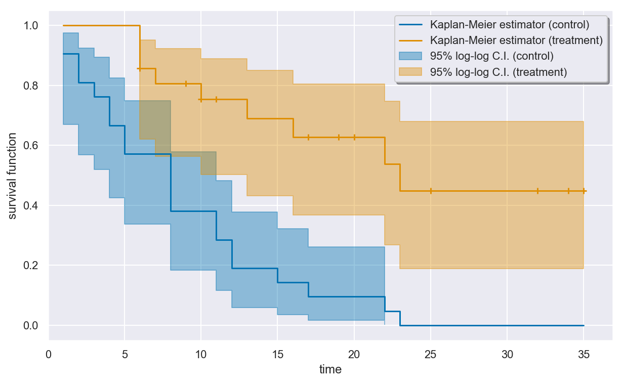
Visualizing the fit
The estimated survival curves for the two groups can be drawn using the
plot() method of the KaplanMeier object. By default, censored
times in the sample are indicated by plus signs on the curve.
In [15]:
plt.figure(figsize=(10, 6))
km.plot()
plt.show()
plt.close()
If you prefer R-style confidence intervals (the kind drawn by
plot.survfit in the survival package, for example), then you can
set ci_style="lines" to get similar dashed-line confidence interval
curves.
In [16]:
_, axes = plt.subplots(nrows=1, ncols=2, figsize=(10, 6))
for ax, group, color in zip(axes.flat, surv.group_labels, ("b", "g")):
    km.plot(group, ci_style="lines", color=color, ax=ax)
    ax.set(title=f"Kaplan-Meier estimator ({group} group)")
plt.tight_layout()
plt.show()
plt.close()
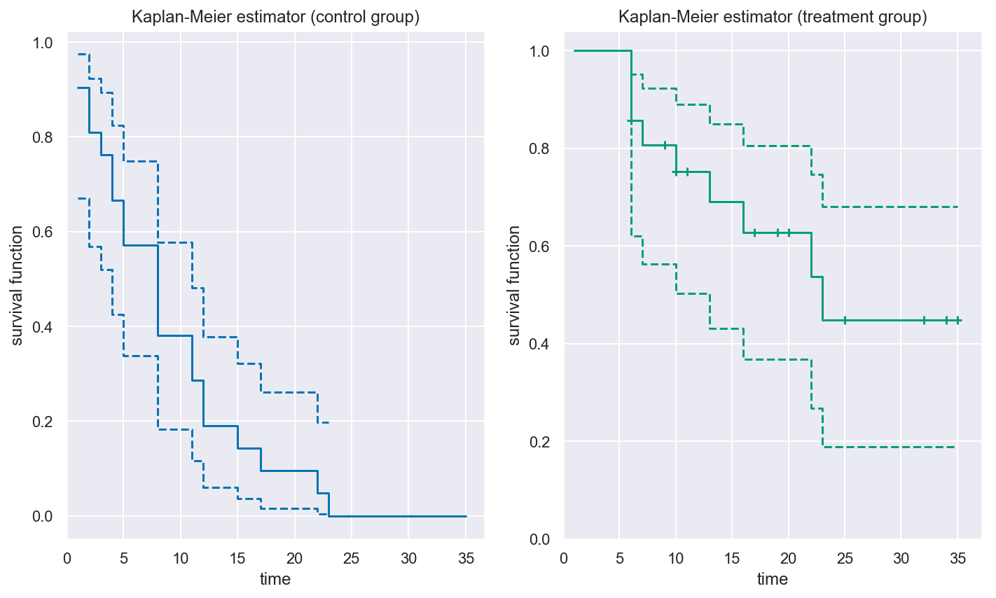
The plot seems to indicate that the patients in the treatment group are more likely to have longer remission times than patients in the control group.
Estimating survival probabilities
The predict() method of a KaplanMeier object returns a pandas
DataFrame of estimated probabiltiies for surviving past a certain time
for each group.
In [17]:
estimate = km.predict([5, 10, 15, 20, 25])
display(estimate)
| group | control | treatment |
|---|---|---|
| time | ||
| 5 | 0.571429 | 1.000000 |
| 10 | 0.380952 | 0.752941 |
| 15 | 0.142857 | 0.690196 |
| 20 | 0.095238 | 0.627451 |
| 25 | 0.000000 | 0.448179 |
Estimating time-to-event distribution quantiles
The quantile() function of a KaplanMeier object returns a pandas
DataFrame of empirical quantile estimates for the time-to-relapse
distribution
In [18]:
quantiles = km.quantile([0.25, 0.5, 0.75])
display(quantiles)
| group | control | treatment |
|---|---|---|
| prob | ||
| 0.25 | 4.0 | 13.0 |
| 0.50 | 8.0 | 23.0 |
| 0.75 | 12.0 | NaN |
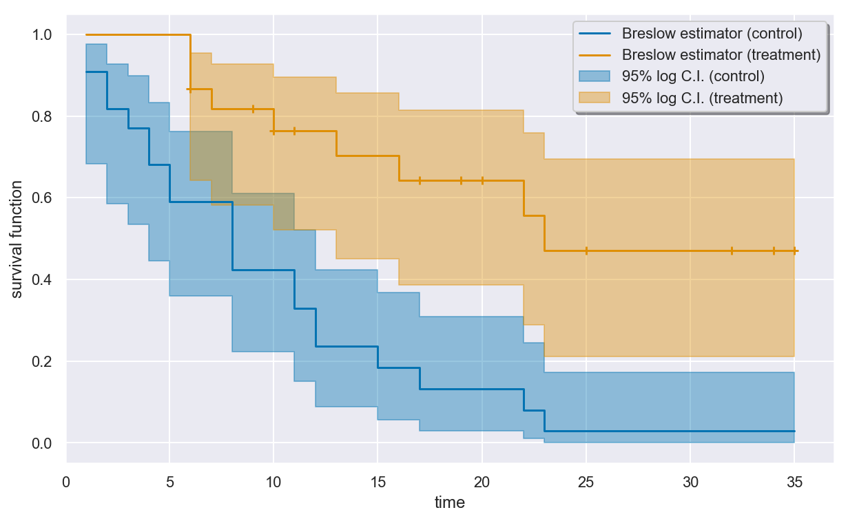
Alternative: the Breslow estimator
The Breslow estimator is another nonparametric survival function
estimator, defined as the exponential of the negative of the
Nelson-Aalen cumulative hazard function estimator. It is implemented in
the Breslow class, and its API is the same as the KaplanMeier
API.
In [19]:
breslow = Breslow()
breslow.fit(surv)
Out[19]:
Breslow(conf_level=0.95, conf_type='log', tie_break='discrete',
        var_type='aalen')
In [20]:
print(breslow.summary)
Breslow estimator

control

total  events  censored

   21      21         0

time  events  at risk  estimate  std. error  95% c.i. lower  95% c.i. upper
   1       2       21  0.909156    0.061226        0.683312        0.976463
   2       2       19  0.818320    0.082140        0.585744        0.927595
   3       1       17  0.771572    0.089766        0.535382        0.897953
   4       2       16  0.680910    0.099488        0.445010        0.833243
   5       2       14  0.590266    0.104848        0.360455        0.761574
   8       4       12  0.422944    0.103020        0.223432        0.610118
  11       2        8  0.329389    0.099135        0.151236        0.520541
  12       2        6  0.236018    0.090224        0.088391        0.423449
  15       1        4  0.183811    0.083959        0.056501        0.368440
  17       1        3  0.131706    0.074475        0.030135        0.309303
  22       1        2  0.079884    0.060298        0.010694        0.244792
  23       1        1  0.029388    0.036820        0.000845        0.172353

treatment

total  events  censored

   21       9        12

time  events  at risk  estimate  std. error  95% c.i. lower  95% c.i. upper
   6       3       21  0.866878    0.071499        0.642147        0.954971
   7       1       17  0.817356    0.082803        0.582866        0.927417
  10       1       15  0.764642    0.092731        0.521681        0.895238
  13       1       12  0.703505    0.103518        0.449985        0.856517
  16       1       11  0.642371    0.111107        0.385958        0.814031
  22       1        7  0.556857    0.124920        0.289195        0.758612
  23       1        6  0.471369    0.131732        0.210555        0.695534
In [21]:
plt.figure(figsize=(10, 6))
breslow.plot()
plt.show()
plt.close()
Estimating the cumulative hazard with NelsonAalen
Nelson-Aalen estimator
The Nelson-Aalen estimator is a nonparametric estimator of the
cumulative hazard of the time-to-event distribution. The NelsonAalen
class implements this estimator. Its API is nearly identical to the
KaplanMeier API described above.
Initializing and fitting the estimator
You can initialize a NelsonAalen object with no parameters and call
the fit() methon on the leukemia data.
In [22]:
na = NelsonAalen()
na.fit(surv)
Out[22]:
NelsonAalen(conf_level=0.95, conf_type='log', tie_break='discrete',
            var_type='aalen')
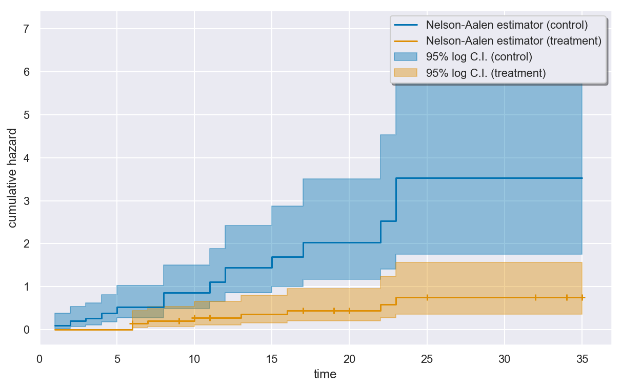
Visualizing the estimated cumulative hazard
The estimated cumulative hazard for the two groups can be drawn using
the plot() method of the NelsonAalen object. By default,
censored times in the sample are indicated by plus signs on the curve.
In [23]:
plt.figure(figsize=(10, 6))
na.plot()
plt.show()
plt.close()